top of page


Covfefe Playground
feat. Trump, Kim, Xi and Vlad
Covfefe Playground
Is a personal project I did over the course of a few weeks. It started as a simple idea about how politicians and world leaders are just a bunch of big kids playing with big toys. The potential consequences of their words and actions are very serious though...
Animation Illustration Design
Fú Express is a Chinese restaurant concept expected to open soon in Atlanta, Ga.

Final Design
Process
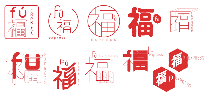
Initial Concepts
The client wanted a design that is influenced by the traditional Red Ink Chinese Stamps. We wanted to do something that represents the traditional, but also is more modern. My initial concepts took the iconic red ink and played with the possibilities that can be made from that. Some of the concepts are more modern, and some are more conservative. It was important for me to play with some different fonts that would break out of the structured stamp.

Second Drafts
he client decided that the top left was their favorite concept. There were a few changes to make like making it bolder, and using more texture. We also wanted to see how it would look with more of a square shape so we simply took the rounded brackets and made them corners. Once we decided on this all that was left was to make the final touches.
Final
The final design achieves the look of a traditional Chinese Stamp without being too traditional. The broken brackets and off center character and name break up the orderliness of a traditional stamp. The curved and lower case font also helps give a more casual feeling to the design that a more rigid and angled font would not. The final logo is monochromatic solid red so that it is easy and cheap to print on many mediums but is guaranteed to stand out.
bottom of page